|
|
Post by Bernard Kron on Nov 1, 2015 7:42:17 GMT -5
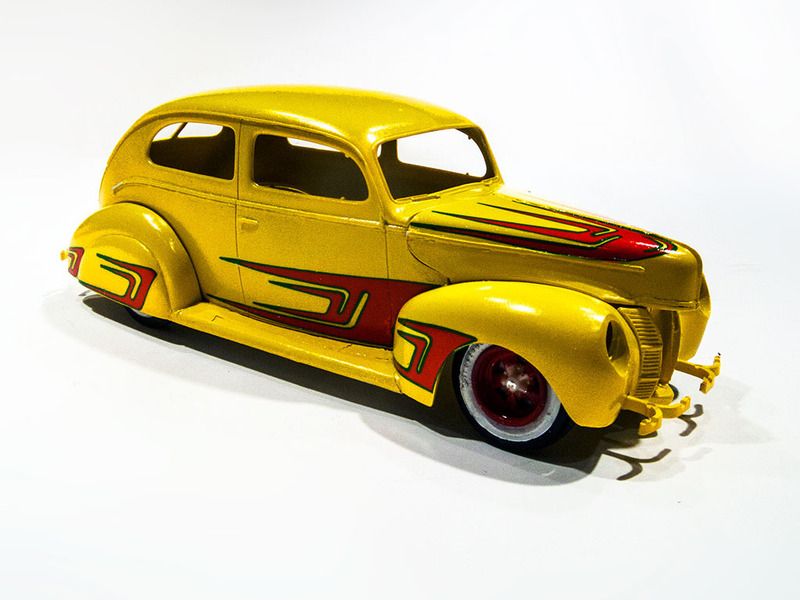
The Australian Automotive Model Builders forum is honoring the 1940 Ford 75th Anniversary with a Group Assembly Scheme which is what they call a Community Build Project. This will be my entry for it. It’s my first ever box art build and will be the yellow custom from the side of the original release Trophy Series of the AMT ’40 Ford Tudor Sedan. I only have later releases and will have to substitute a few parts and have to do something about the scallop decals. But at least it’s otherwise relatively simple and gives me a chance to get it built in time for the December deadline. Here’s the box top and the side panel:   And here’s a close up of the yellow custom version with the cool early style Dean Jeffries scallops. You’ll notice I circled the rear fender area. There are 2 scallops back there, If you compare the original decal sheet to the illustration and add up the number decals, taking into account the rear deck decal on the sheet which wouldn’t be visible in a front ¾ view, there should be 11 of them. But on the sheet there are only 9! And to compound the problem the decals for the rear fender on the sheet don’t actually look like the ones in the illustration. Here’s the yellow custom:  And here’s the original decal sheet as shown on the wonderful and invaluable Drastic Plastics Model Car Club instructions pages (see public.fotki.com/drasticplasticsmcc/mkiba-build-under-c/amt-instructions/automotive-cars--pi/ford/1931-1940/amt-19391940-ford-s/ ). I circled the offending decal.  The rear fender decal is really quite large Here’s a picture from the inside of the instruction sheet showing a slightly different variation on the box art car – it’s a ’39, it’s dark colored, and, frankly, it sits way lower (no rake, too) than the kit offers. But, most importantly, the fender skirt scallop (in this version there’s only one) doesn’t look like the one on the sheet (it’s skinnier), and it’s much smaller.  The back of the decal sheet offers a clue as to what they intended, although I think it’s still too large, but at least it looks like the one on the sheet.  But, Box Art is Box Art, so yellow it will be, and with the double scallops on the rear fenders! So… since the original decals in the DPMCC scan were pretty funky anyway, I decided to reconstruct them using Photoshop. And, since I was doing that, I decided to create my own version of the two scallops on, and behind, the rear fender skirts. I think I did a pretty fair approximation. The challenge now will be to double check my work by making some proof decals and applying them to the actual body, and then find a custom decal house that can make some for me since they have a white border which I can’t print! Oh, and get it all done in time for the December build deadline. Here’s my version of the kit scallops, including the fictitious double scallops on the rear fender:  Other than that I’m thinking of a pearlescent yellow paint job, in keeping with era (the box art is somewhat silent on the matter…). I have a set of the correct AMT style Moon discs but lack the original capped exhaust dumps that came in this release. I’ll probably use the somewhat larger set from the AMT ’49 Ford kit. I may also take some liberties with the very plain interior in the drawing, and perhaps finish the running boards and engine compartment in white, although the white ‘boards may prove to be too great a departure from the box art to survive. The car will be lowered beyond the raked stance that the kit yields (the box art doesn’t appear to have any rake). And I’ll attempt hand painted whitewalls which would have been the practice at the time. Other than that it will be pretty much straight out of the box but with more modern attention to detail. Thanx for lookin’, B. |
|
|
|
Post by fordrodnkustom on Nov 1, 2015 10:11:12 GMT -5
Wow, good catch on those rear fender decals,I never noticed that. Your reproduction solution looks great. I'll be watching this one!
|
|
|
|
Post by harron68 on Nov 1, 2015 17:31:22 GMT -5
Agreed on blah character of the interior. To me some of the early things builders did as far as body work went included removing trim, head and tail light altering and, of course something with the grille. A touch or two on the body would both personalize it to your taste and make it more interesting. The '40 sedan always seemed a distant second to the coupe. Fine idea on pearl yellow as a different look from plain yellow. Good luck.
|
|
|
|
Post by Bernard Kron on Nov 2, 2015 22:04:33 GMT -5
Thanks to the generosity of a member of the Model Cars Magazine Forum I was able to get a clean 600 dpi scan of an original decal sheet. The first image I had made it very hard to determine the white areas. In fact the sheet has white pinstripe and lettering decals which were completely invisible. By fiddling with the brightness and contrast on the high quality scan I got I was able to clearly see the white areas. Using those I re-drew the decal art and adjusted my rear fender and skirt decals to more closely match the details of the AMT original art. Here's a fake-o rendering of the original sheet with all 11 decals required to make the yellow custom on the box.  |
|
|
|
Post by Bernard Kron on Nov 4, 2015 22:24:25 GMT -5
I think I’ve finalized the artwork. In order to test for fit and any detail changes I printed a set on plain paper with green substituted for the white borders and attached them to the bodywork. I was surprised on how good the fit turned out to be, especially for the skirt and rear fender scallops which are not on the original decal sheet but are on the box art drawing. I had though I might print some actual decals but it appears it will not be necessary. So, now to create proper vector-based master art and then off to the decal printers. Here are a couple of (very rough) mockups showing the overall look. The scallop bits are held in place with cellophane tape. Thanx for lookin’, B.   |
|
|
|
Post by harron68 on Nov 5, 2015 10:06:00 GMT -5
Good work on the scallops, tho I always thought they weren't designed to fit the contours of the car. Ones on the cars of the '60s seemed better tailored. Good luck on the rest of it. Pearl yellow will look good on the long roofline.
|
|
|
|
Post by fordrodnkustom on Nov 5, 2015 19:20:10 GMT -5
Looking good so far. Waiting patiently for the next installment. Good job on the decals.  |
|
|
|
Post by Bernard Kron on Nov 5, 2015 21:48:48 GMT -5
TRaK member John Goschke, a fine modeler who knows a thing or two about '40 Fords and scallop paint jobs, let me know that he thought the rear deck decal was actually supposed to be positioned inverted the way that I have positioned on the lower splash pan pointing upward. A search of web images drew a blank and the instruction sheet doesn't show decal placement other than the box art and the little illustration shown above. So I checked the image sizing against the 1:1 scan and it was spot on. Next was to flip the test "decal" and place it in the lower position. The dimensions conform precisely to the width of the bottom pan and the contour of the trunk lid edges as they join up to the fenders. So, on the evidence it appears to be as John said. Below is a comparison of the two. Having set my "mind's eye" to the upper position it looked a little odd to me, but it's visually logical in that the scallops all work together to draw the eye toward the lower edges of the bodywork.  |
|
|
|
Post by coyotecrunch on Nov 5, 2015 22:42:55 GMT -5
I like the progress, and wonderful research on the decals. But seeing these with the green edge, knowing the yellow is coming, call me crazy, BUT I think red with green edge decals would be AWESOME on the yellow!!! - I know, I know, not box art original, but would look cool. Then again, I love green, it's a weakness, LOL
|
|
|
|
Post by Bernard Kron on Nov 6, 2015 13:13:04 GMT -5
Thanks! I am bound and determined to stay on the straight and narrow and keep this a box art build. But you're right, the green trim would look tuff! It was, BTW, a combination seen with some frequency back in the day. Several people have inquired about getting copies of the scallop decals I'm working on. You should know that, if you want excellent copies of the original, Greg Holland (vsrn on TRaK) at Greg's Decal Graphics has the complete original decal sheet including the racing numbers, the "Rapid Rickshaw" logo, and the pinstriping. Greg is very well known for the high quality of his work. Here's a link to Greg's site: vsrnonline.com/gregsdecalgraphics/index.htm The white logos, shoe polish numbers, and pinstriping are highlighted in black in the sample image, but like the white areas around the scallops, which unfortunately don't show up on the image Greg sent me, they are printed in white in the decal set he makes. Greg uses the system Fred Cady uses where the white areas are printed as a separate decal layer. Greg is very well known for the high quality of his work. Here's a picture Greg sent me of the sheet:  |
|
|
|
Post by coyotecrunch on Nov 6, 2015 20:25:20 GMT -5
Oh wow - I am gonna head on over to his link now - thanks so much! I wonder if he does custom work? I bet he has a nicce ALPS set up. I myself, like you, dabble in making my own, but I just cannot justify the thousands for an ALPS printer for a simple hobby, that honestly, at 51, I may have a max of 20 years left in anyways. But I do thank you for the advice, i will be checking into this!!!
|
|
|
|
Post by Bernard Kron on Nov 6, 2015 22:51:51 GMT -5
...I wonder if he does custom work? I bet he has a nicce ALPS set up. ... Greg does do custom work He has some sort of laser printer setup that allows him to do white, but only as a second layer. He can't do metallics, foil, etc. which would require a Micro Dry (Alps) type printer. Unfortunately they're about $1500.00+ reconditioned and there's a nasty and persistent rumor that the ink cartridges for consumer level Micro Dry printers will cease production in 2016... |
|
|
|
Post by Bernard Kron on Nov 10, 2015 18:35:17 GMT -5
This is a small update. I got the stance dialed in. The dropped front axle from the kit had some leaves removed from the spring and the front cross member shaved a bit. I also lowered the rear suspension to the maximum by hogging out the rear cross member and sinking the rear spring down as far as it would go after trimming the rear suspension stops. This will consistitute a slight departure from the box art which shows the front end slightly higher than I have it. However, out of the box the rear suspension is stock height and, with the kit dropped axle the car has a classic late 50'-early 60's California nose-down rake. This stance is lower overall and just about pan flat, more in keeping with a car with skirts. The body I've been using is getting a bit worse for wear. I've used it as a mockup on a couple of builds already and it's picked up some nicks and scratches. I have a complete kit with the bags unopened and I think I'll work from that one from now on, using the chassis I have set up. I also got some paint, Tamiya TS-16 Yellow and Tamiya TS-65 Pearl Clear. I'll do a test shot to make sure the effect is what I'm going after. Once the decals are printed and applied the whole deal will get transparent clear gloss coats. Thanx for lookin', B.  |
|
|
|
Post by harron68 on Nov 11, 2015 8:26:37 GMT -5
For what it's worth, scallops as shown on this kit and almost all scalloped cars have the motion implied with solid part forward and narrowing points to the back as the car moves forward. "Points up" on the trunk would be odd. Front is lower than I'd choose. Seems like it would affect steering, but then it's only a model. Good luck!
|
|
|
|
Post by Bernard Kron on Dec 14, 2015 21:57:16 GMT -5
I hit a major log jam on this project as I learned all about having custom decals made, in particular the complex ins and outs of ALPS printers and their relationship with bit map images. It’s far too arcane for this w.i.p. but the bottom line is that I had to make a command decision regarding whether I would stick with white edges on my decals or seek another solution, especially if I was to celebrate the 75th anniversary of the ’40 Ford and not the 76th! So, in order to make the December deadline for the community build I decided to change the decal art. For those who have followed this build so far you might remember that I had done some sample art that had green edges so I could print check decals on my home inkjet printer. As it happened I got a lot of complements on the look they created so I decided I would use green edges on my final decals. Progress has been made on other fronts in the meantime. The body was prepped for paint. This involved the usual filling and sanding to eliminate seems and dips, and an important modification that’s specific to the AMT ’40 Ford series. A big thank you to John Goschke for this one! The trim molding on the AMT ’40 Fords (all 3 of them - .coupe, sedan and sedan delivery) are very “weak”. They’re shallow and are difficult to foil properly, particularly on the hood. I noticed on a w.i.p. that John posted he was adding styrene strip to the moldings. I asked John what he was using and he told me .030” x .010” strip. So that’s what I used. While I was at it I added the additional trim molding above the grille that’s missing from the AMT ‘40s. Hopefully this will all pay off come BMF time. The basic body was the painted Tamiya TS-16 Yellow with three coats of Tamiya TS-65 Pearl Clear. The pear clear was a disappointment since, much like Tamiya’s Pearl White, it lacks iridescence and doesn’t show up well. Oddly, as you’ll see in the pictures below, digital photography seems to highlight the iridescence more than what you see in real life. The motor is stock from the kit, of course, and is about done except for wiring and plumbing. One cool feature, thanks to Johnny Stäveborn in Sweden, will be a set of original exhaust dumps from the first issue of the kit, just like on the box art. As long as I was departing from the strict box art by doing the green edges I decided to proceed with the white trim theme. The undercarriage is entirely done in white and yellow and the engine compartment is finished in white, too. On the box art the engine compartment is yellow. The interior will be box stock finished in white with gold trim. Here’s some pictures of the body. It will get several coats of clear. Perhaps that will enhance the pearlescence, although I don’t have high hopes on that…     Below are some detail shots of the final decal art, the engine compartment and the undercarriage. I think I have a shot at making the deadline – fingers crossed! At least the green trim goes with the holiday season. I think the overall look will stay faithful to the box art. Thanx for lookin’ B.    |
|


 It's an interweb thing.....